Digitizing of annual pension information. The goal was to make it easier for customers to gain information about their pension and to easily increase their savings online.
Pitch that I worked with for about four days.
USER RESEACH
How do you react when your pension information arrives in a letter? These where answers I got when I asked people around me:
1. It is complicated and boring and I get anxious about thinking about my pension. 2. I do not understand and it is difficult with all calculations and figures 3. I have no control and don't even remember how much I save today. 4. How to change? The step to really increase savings is complicated, I do not really know how to do and how my savings affect the pension.
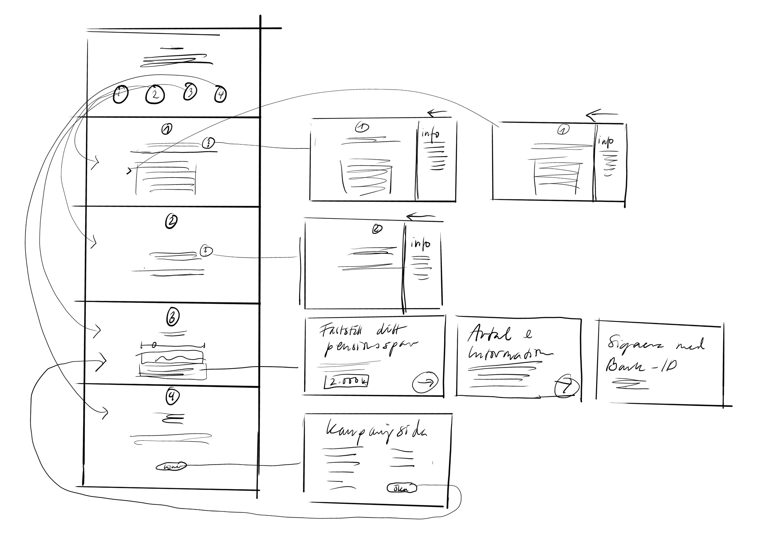
CONTENT AND FLOWCHART
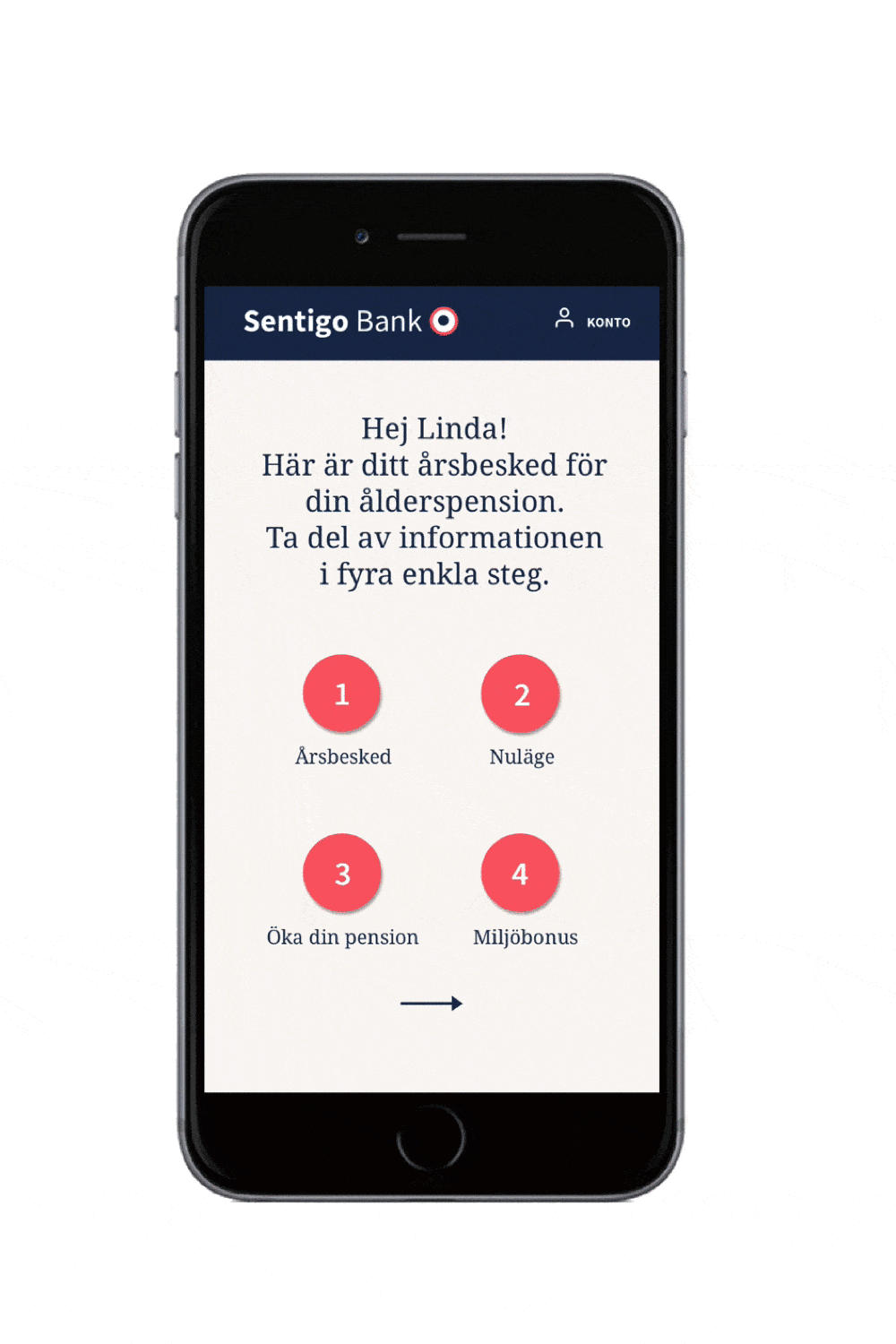
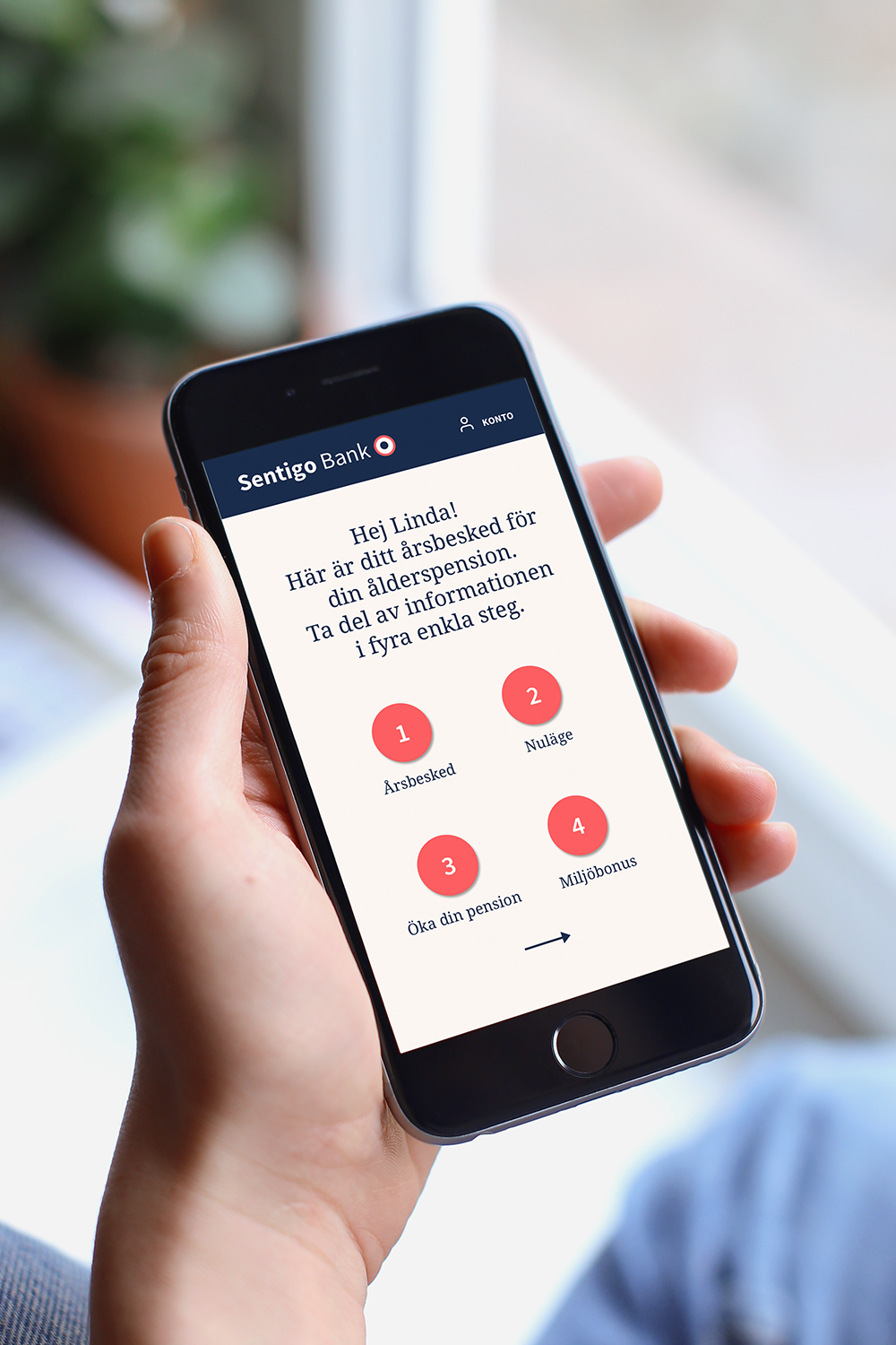
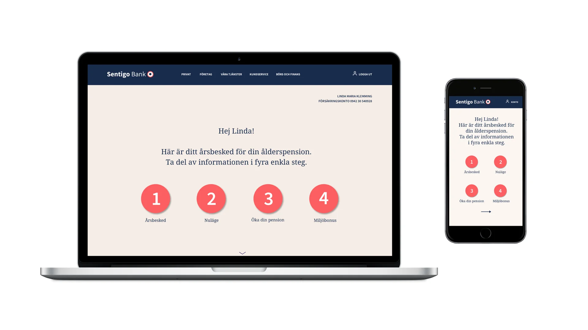
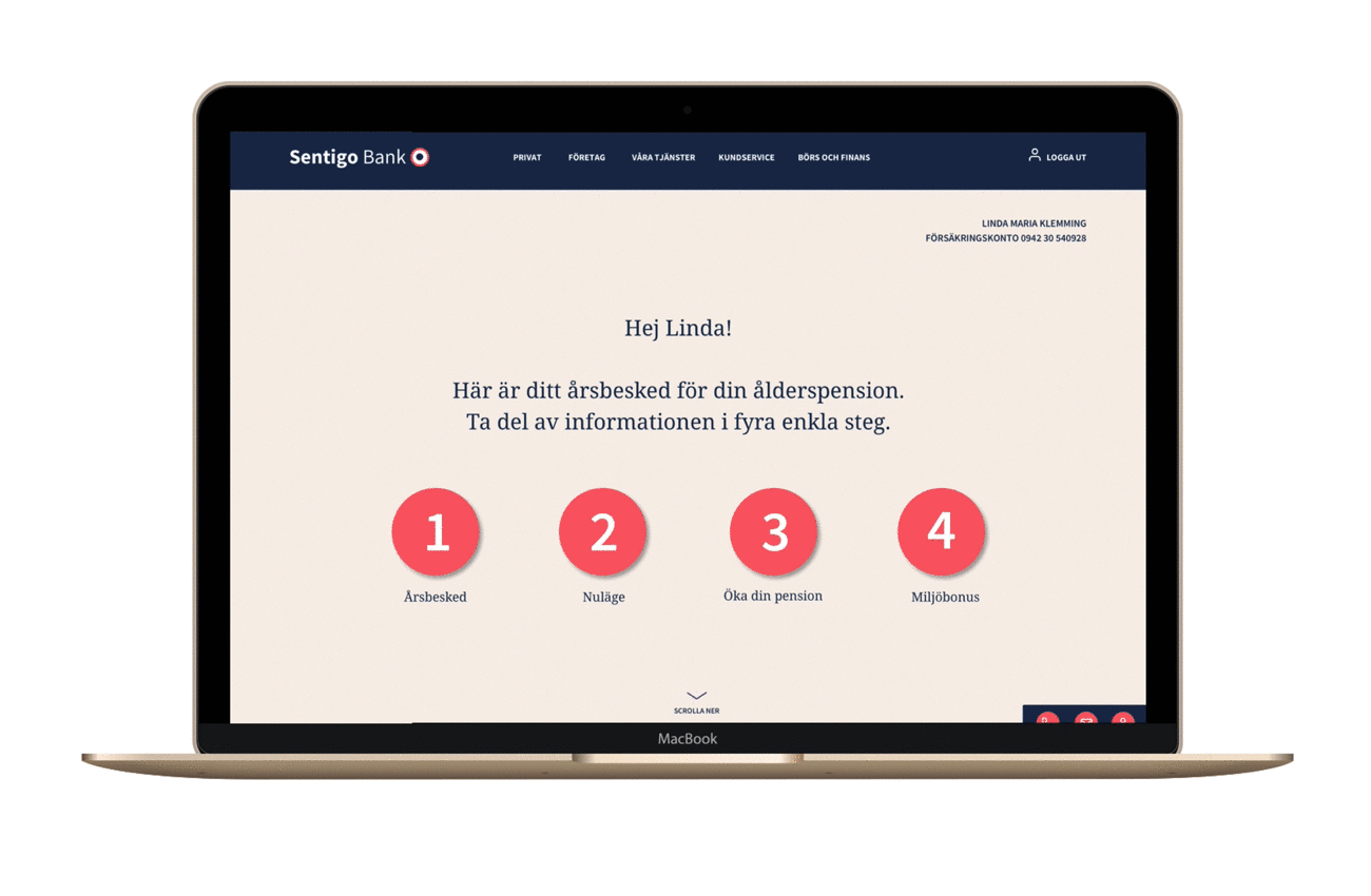
I started by dividing the information into four steps.
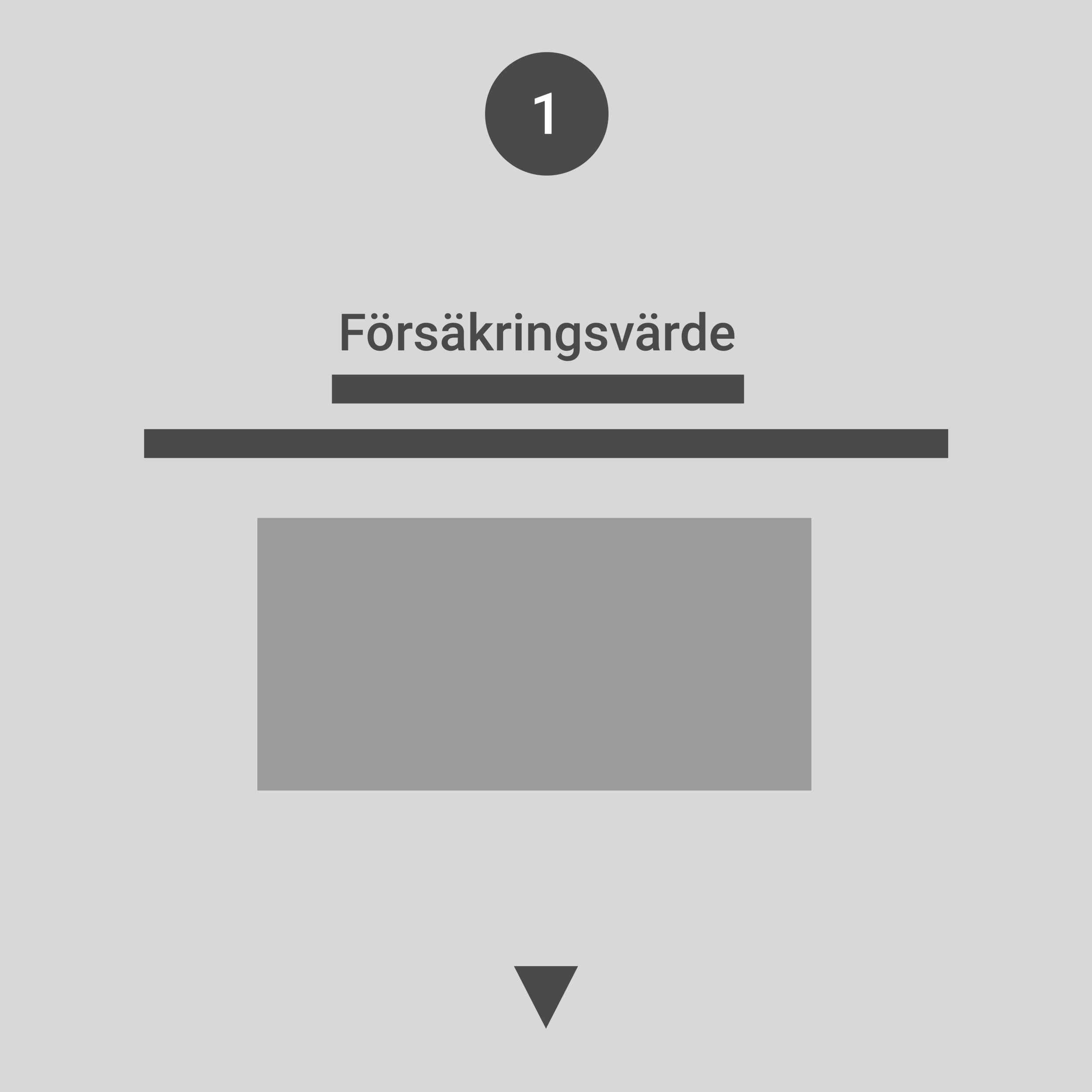
1. Start page with information about the content
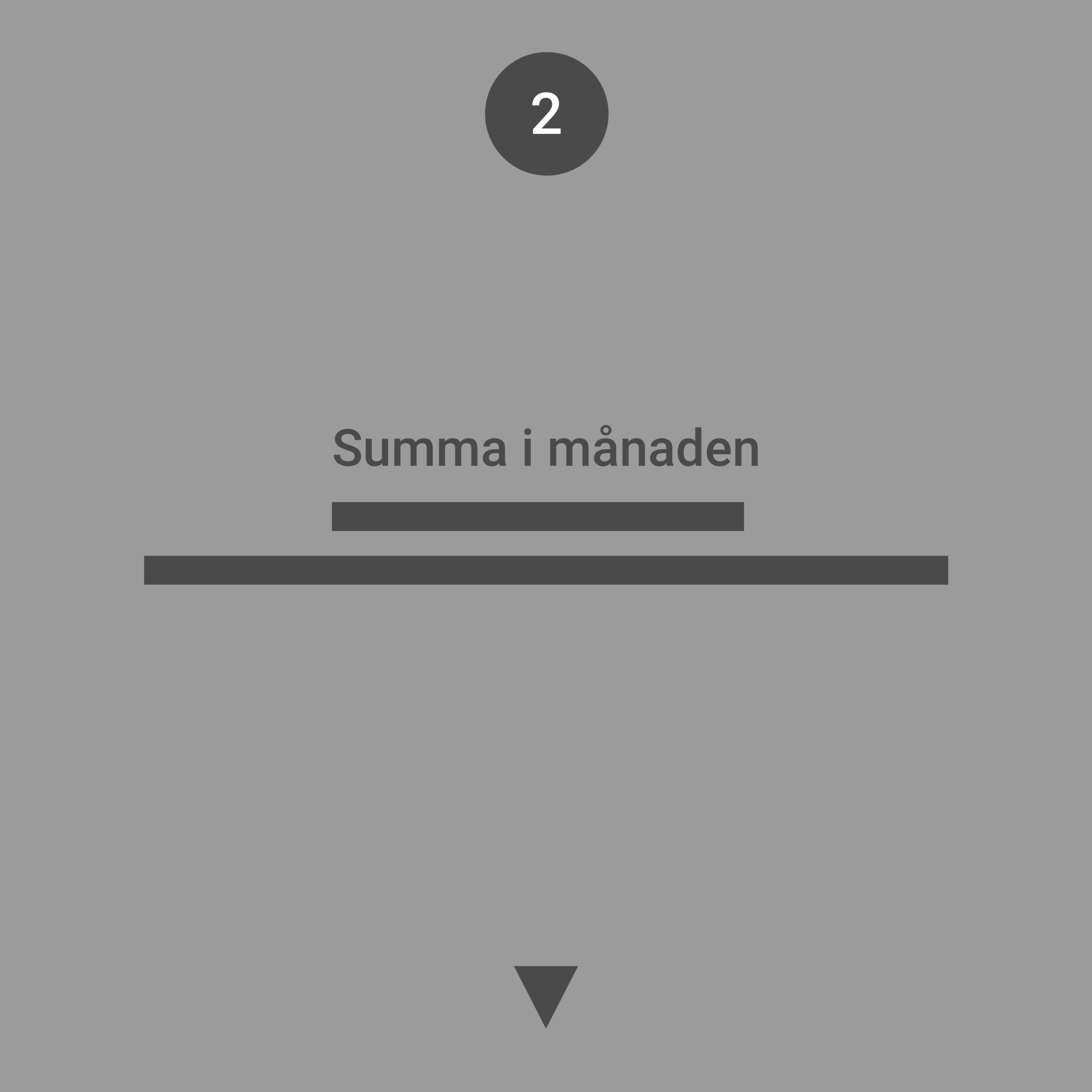
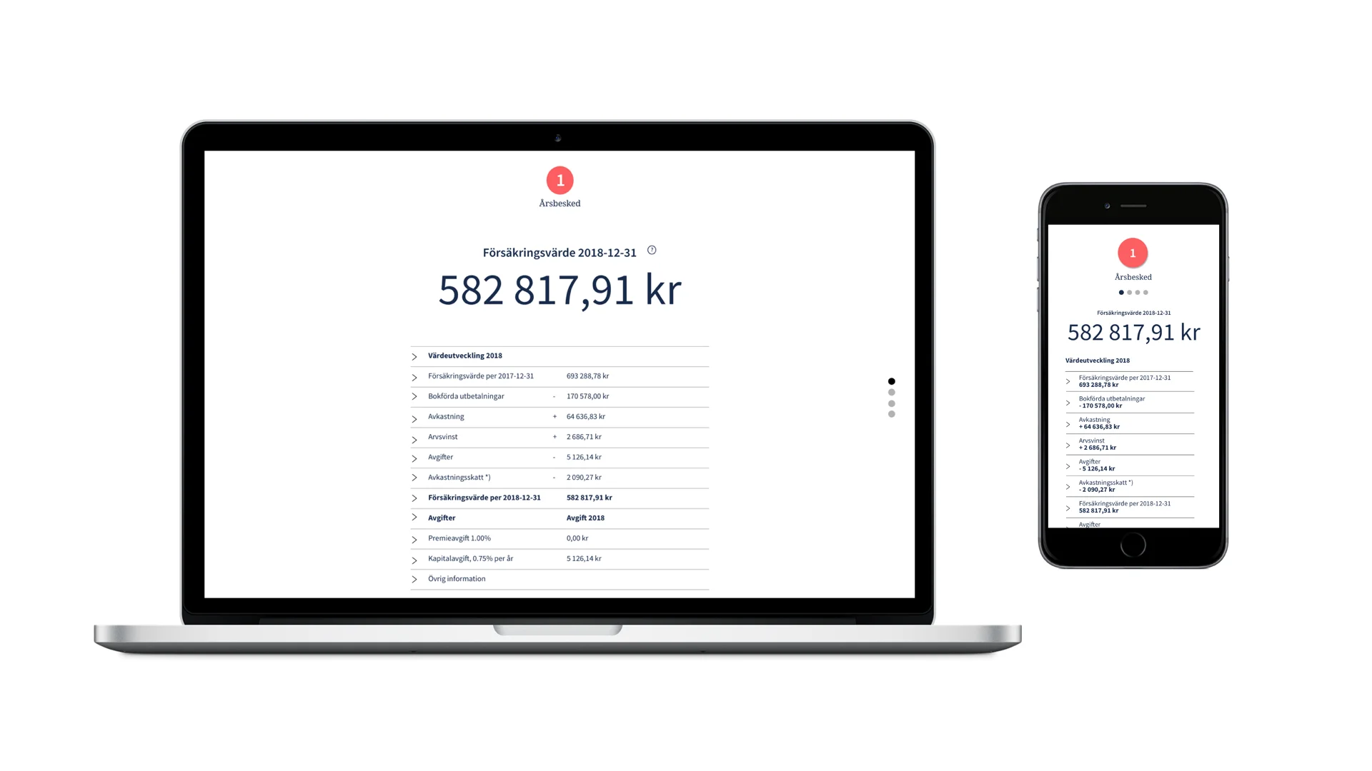
2. How much money I have.
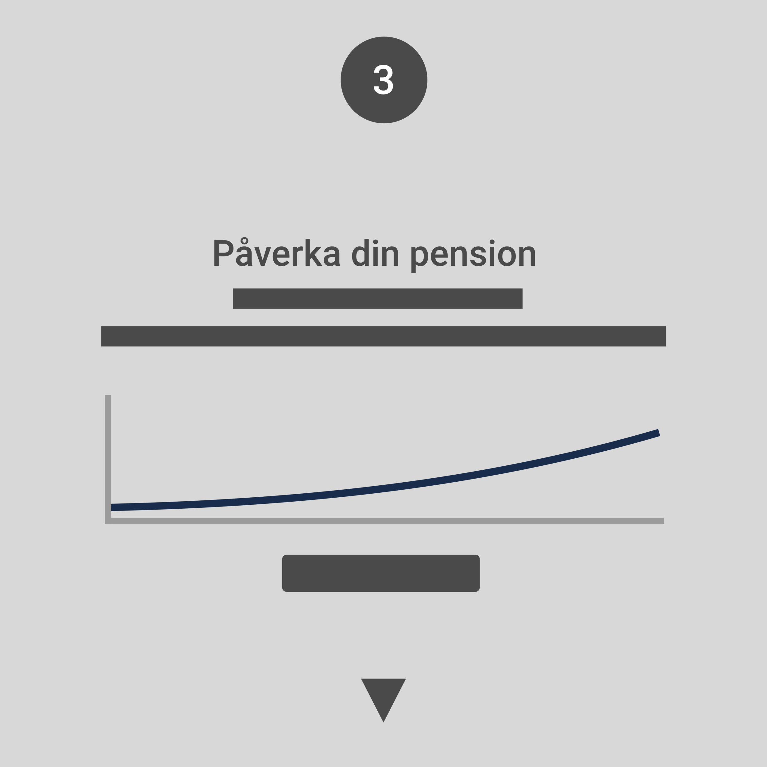
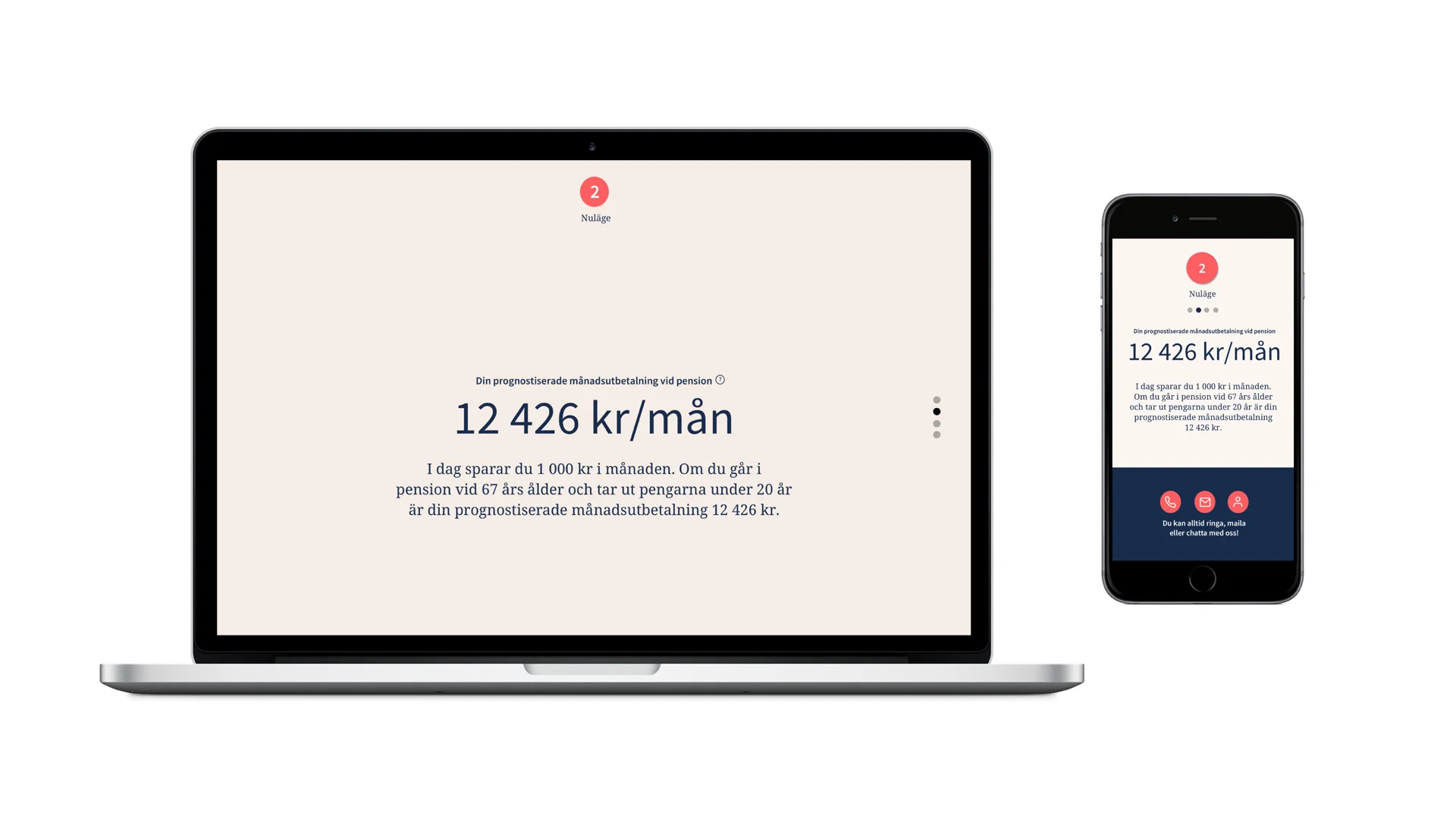
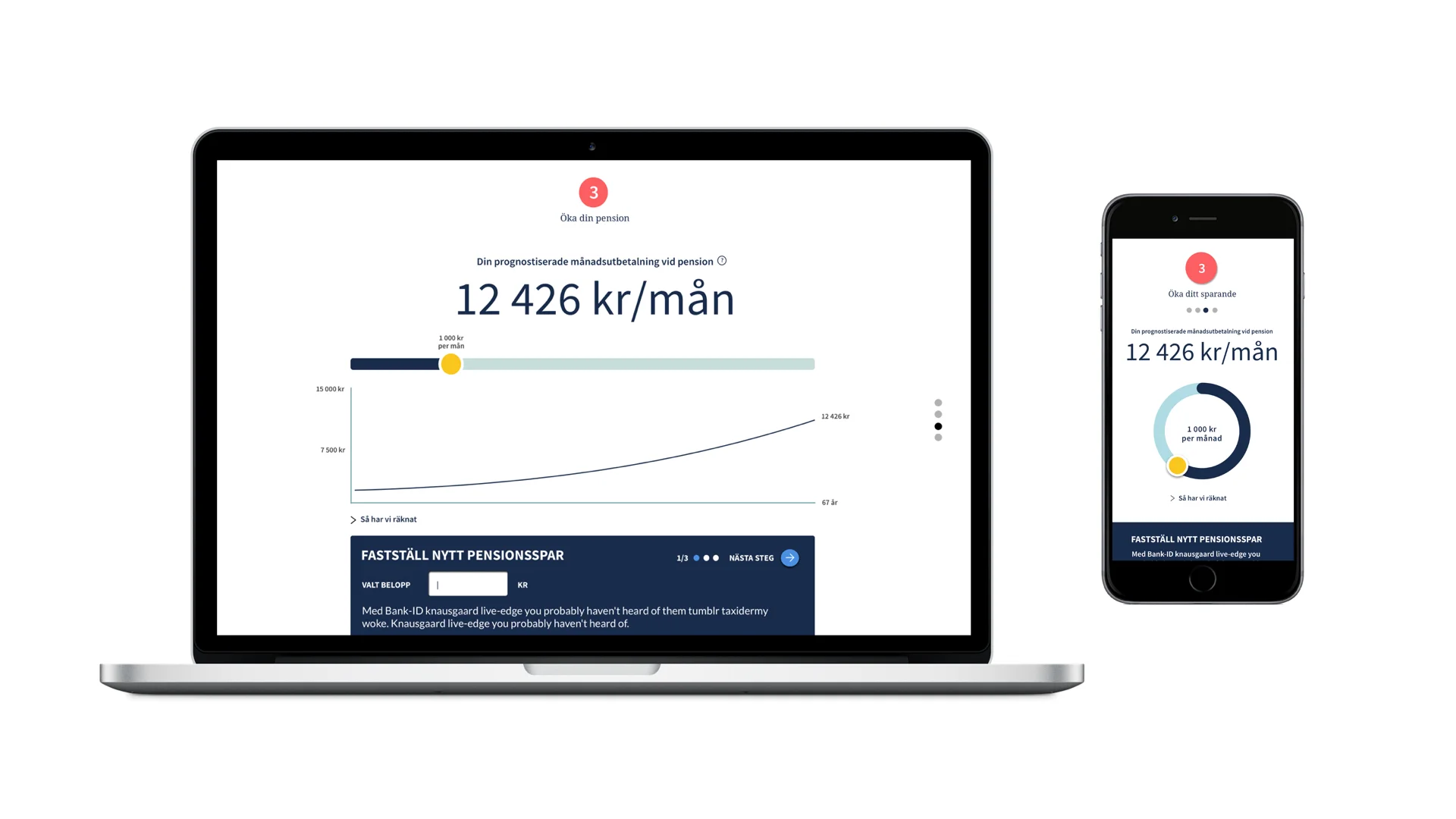
3. What will be my estimated pension per month?
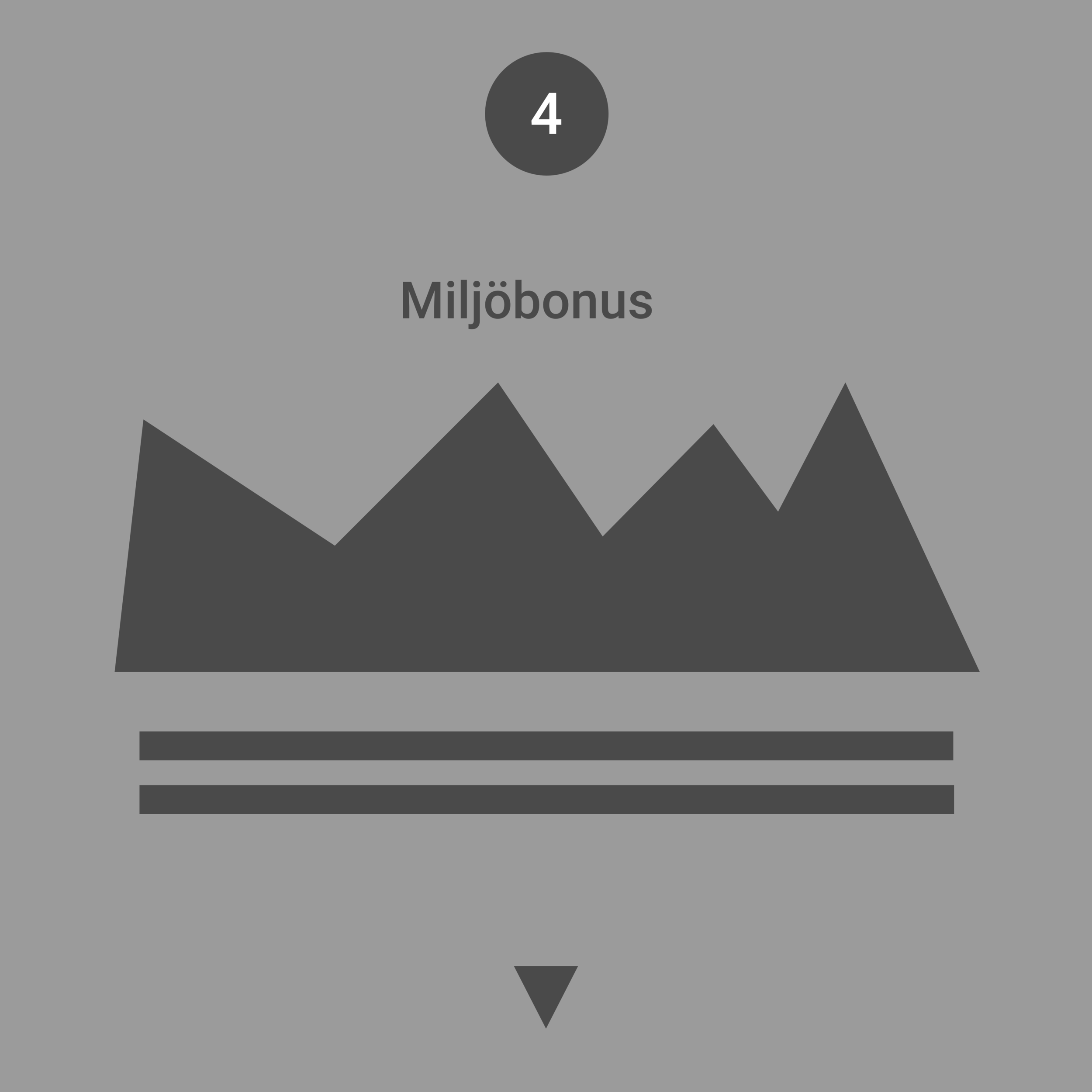
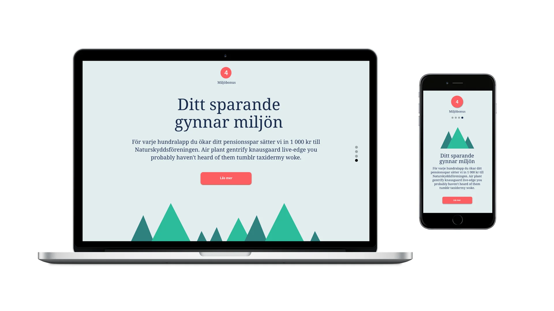
4. How does my savings affect my pension?
I also added an attractive bonus where the bank would transfer a certain amount of money to an environmental organization for every hundred crowns the customer increases his or hers savings.
SKETCHING
To reduce the number of clicks and give an overview, I chose to put the information in a scroll. The four different steps are divided using color tiles. In the desktop version, the user scrolls in depth because its is the most common. In the mobile version, the user navigates sideways for a faster transition.
DESIGN CHOICES BASED ON THE TARGET GROUPS MOTIVATIONS
1. "It's complicated and boring” I have chosen classic bank colors mixed with nice shades of pink and green to lighten up and include as well as playful and clear illustrations that visualize simplicity.
2. "I don't understand” The customer is met by a personal tone of voice and I have used a soft and friendly semiserif. Interaction choices are made clear and educational with numbers and arrows that show the way, that is to prepare the user for the information that will be explained.
3. "I have no control” Clear information on how the user's savings and capital currently looks.
4. How to change? By visualizing with graphs how saving affects pension, it becomes easier to understand. The user immediately sees how the monthly amount changes when the parameters change. On the same page you can click in a new amount and sign with Bank ID.
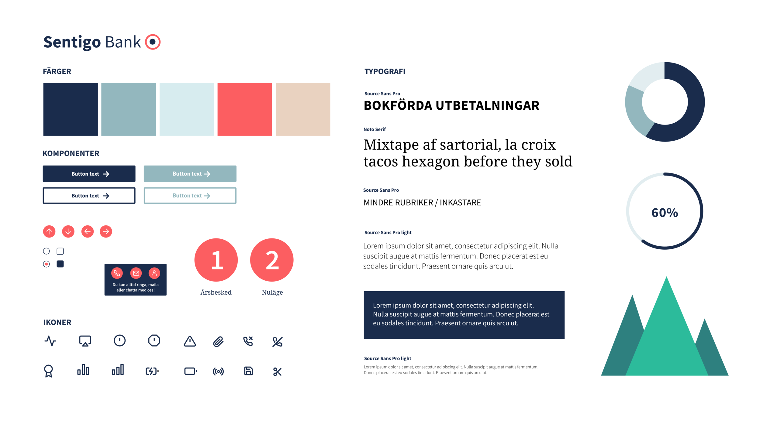
STYLESHEET
DESIGN
DESKTOP
MOBILE